Designing Thumbnails

One of the most important parts of a YouTube video is not the content (unfortunately..) but the thumbnail!
Think about it. When you click on a YouTube video, do you really think through of what this video is about? Or do you just "What's this?" looking at the thumbnail?
See?
That is why designing good thumbnails is really important.
I started getting comments on my YouTube channel.
I got 3 notifications on my YouTube channel, and was "Oh! Nice! I have interested viewers!"
But it happened that all 3 were people who wanted to upgrade my thumbnail design...
OK, OK, now it is clear that I suck on thumbnail design. That is very clear. Thank you for rubbing it 3 times into my face.
So I started chatting with one of the commenters, "Tell me, what is a great thumbnail?"
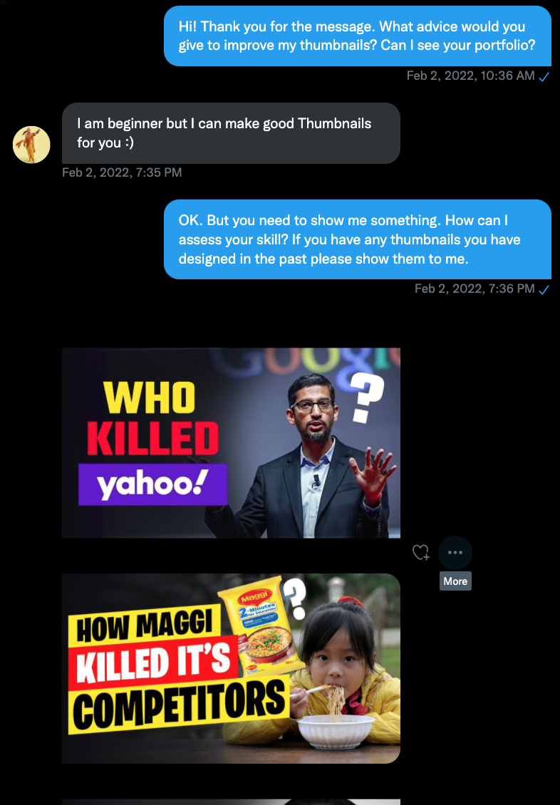
So I learned that for the title, it needs to be very bright. Yellow on Black, Black on Yellow, White on Red.
The below was my original thumbnail.

I asked the commenter if he/she could create a thumbnail?

Pretty interesting. (I wonder where you get those animated version of Elon?)
So I started making a few thumbnails. The rules:
- BIG TITLES
- Have some back ground so the letters pop up more
- Have a picture/drawing on the right side that makes the thumbnail interesting
I also had my son comment on my thumbnails. Feedback!
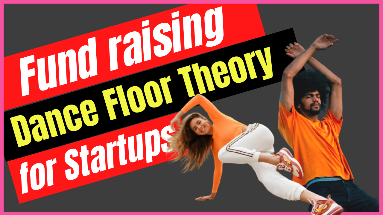
OK. It is easy to read, maybe, but it doesn't really communicate that it is for startups. It looks more like a dance video.
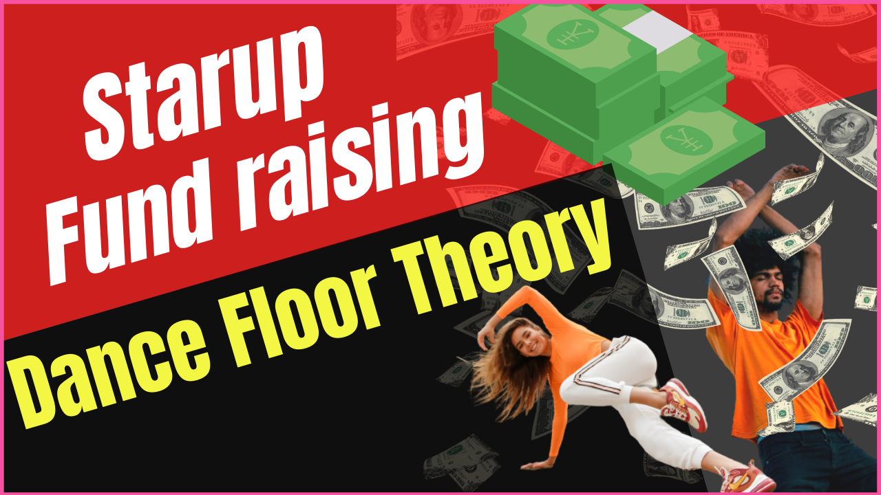
So let money rain from the sky. Now it looks like the dancers want to get rich!

My son said that, since it is a video related to money, the background should be in a color that is money related. OK! Great advice!
Gold, green! Now it looks that a dancer is getting excited that it is St. Patricks day with all the money.

Some color changes.. Letting more of the "Startup" pop up.
Someone said "less is more" or "simplicity is always better".

OK, so here is the final version (so far) of the thumbnail.
I think it looks much better than the first version!
I still can't figure how to communicate "startup" in an image.
If anyone has a good idea, please let me know!
I do all my design using Canva. It has been soooooo much easier. Since I don't have Adobe Illustrator / Adobe Photoshop skills, I had been doing my designs using Microsoft Powerpoint back a few years ago. I would layer images, fonts, created images with transparent background, all on Powerpoint.
But that was very frustrating. The file size would usually get too big it would start failing on me.
I am so happy with Canva. Great software!
And please subscribe to my YouTube channel!